

Product photos are one of the most important elements of an online store, and should be at the top of the list when looking at ways to improve conversions.
This is because consumers are incredibly reliant on visuals when making their shopping decisions. They want to know that the product is good quality and that it has the specific details they’re after.
In brick and mortar retail, customers are able to walk up to each product and pick it up, turn it around, and even try it on. But as an ecommerce store owner, you bear the burden of matching that experience as best you can through photography or video. So your product photos have to be top-notch – no exceptions.
- Assuring visitors that you’re a trustworthy, professional business to shop with
- Building a perception of quality for your products
- Contributing to a simple browsing experience, making it easy to compare similar products and find what they’re looking for
- Creating doubt in the customer’s mind that they’ll have a good experience shopping with you
- Creating doubt that they will be pleased with the product itself
- Confusing customers while browsing, causing them to become frustrated and quickly leave the site
How to Achieve the Quality That’s Expected From Customers In Your Product Photos
If you’re responsible for providing the product photography on your site, here are the best practices when hiring a photographer or when producing them in-house.
1. High-resolution and well-lit
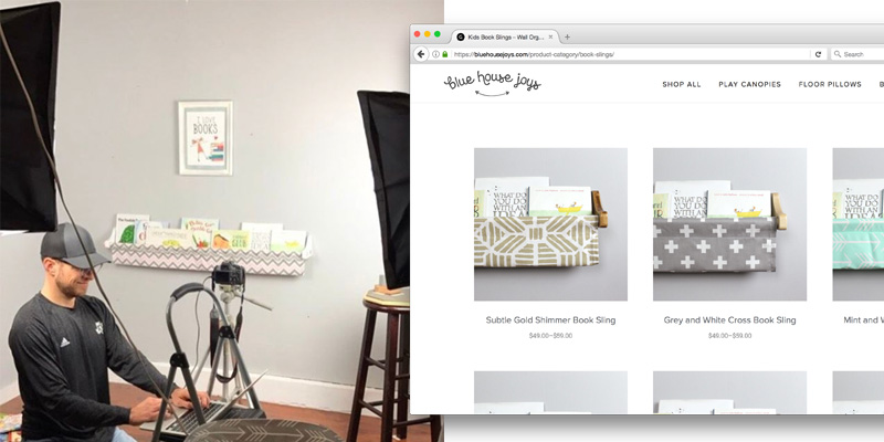
Low light leads to dingy, fuzzy looking product photos, which will make it very tough on the customer to see the quality. If you’re shooting your own product photos, find a window with good natural light or get a cheap lighting kit to brighten things up.
The native camera on some of the newer iPhones will get the job done, as they produce some really good photos (even in low light areas). Make some simple brightness or levels adjustments in software like Photoshop or Pic Monkey, and you’ll be good to go.
2. Simple, consistent and uncluttered in the background
Avoid shots that have other products or people in the image that will distract from the main product. There’s a reason that Amazon requires every product sold on their site be against a plain white background. It keeps a consistent design and look for the site and all of the focus is on the details of the product.
Use a light colored backdrop for all of your product shots to achieve similar results.
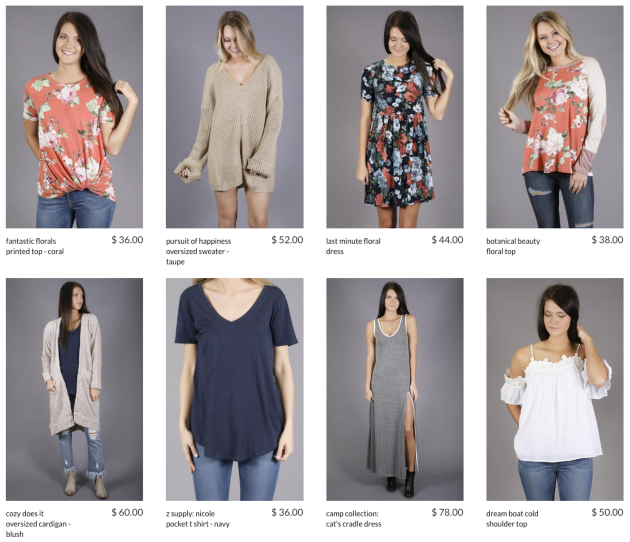
Using the same, solid background in all of your product shots creates a uniform and clean look when browsing through collections. This puts all of the customer’s focus on the product itself – which is where it should be.
3. Close up on the product
Photos that are too zoomed out and leave too much space around the product make it difficult for customers to see the quality. Again, you’re trying to match the brick and mortar experience as best as possible. You want them to be able to see and compare the important details when looking through your online store.
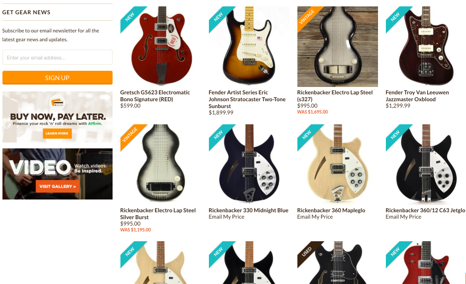
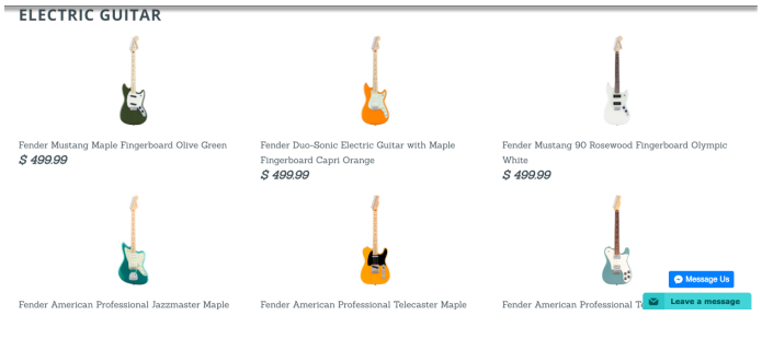
Compare these two collection pages from different sites in the guitar industry. Which one communicates better quality to you? Which one is easier to compare details?
4. Consistent look with other products in its category
Products that fall within in the same category should be positioned and displayed the same, again, so that you take away some of the mental energy needed by your customers to quickly compare the options.
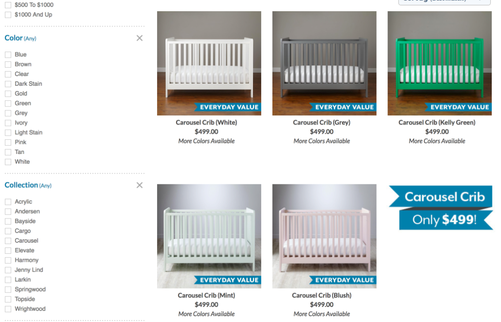
Notice how easy it is to compare these cribs from landofnod.com because they’ve shot their photos from the same perspective and against similar background and lighting.
5. Same image size and orientation
Most online stores benefit from having a clean, aligned product grid throughout the site. The best way to achieve this is to make sure your main product images are the same dimensions and orientation.
Below is an example of a store using photos of different proportions, which creates misalignment in the product grid. This is often perceived negatively by customers.
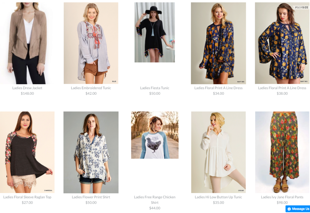
Often the theme or platform that you’re using for your store will help you out in resizing or cropping product images to the same size in a product grid, but that still requires that the images you are using have the similar proportions.
I typically recommend either square (e.g. 600x600px) or vertical (e.g. 500x750px) orientations as they maximize screen space and provide a familiar display of your products to customers. Check with your theme or developer to see if there is a size that is optimal for your site’s design.
If you have any questions about product photos, feel free to leave a comment below and I’ll respond when I can.